Code and Data

Code and Data looks at different types of data and graphs. A numeric data set is formatted first and then displayed through code. Three types of graphs are addressed here: Line, Bar and Donut graph.
3 Graphs
We were given data on CO2 emission in Afghanistan. Because we received an overwhelming amount of data, we narrowed it down to CO2 emissions in Afghanistan from 1949 to 1968. With this data, we experimented with 3 different graphs on p5.js to visualise this data.
Donut
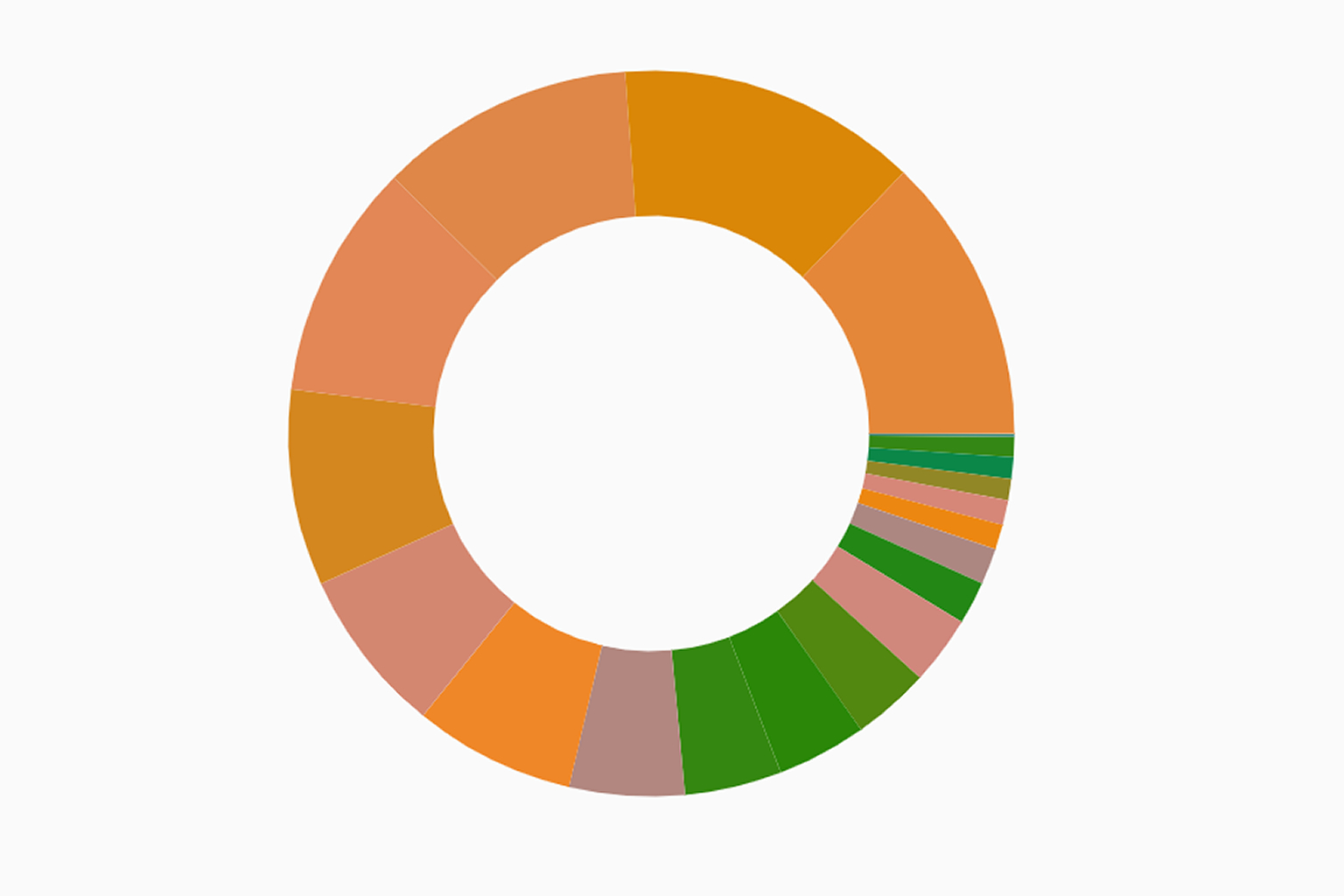
Donut graphs are a variant of pie charts but with a hole in the middle and display data as arcs rather than slices. Similar to pie charts, their goal is to illustrate proportions. The data displayed is static, in a sense that it cannot show changes in value over time. It is best used to showcase proportions of quantitative data within a fixed time frame.
For example the ratio of votes in a city for different political parties. This graph is also difficult to work with when it has too much data to display. Furthermore, human eyes are not the best at processing proportions. Especially if the proportions are too small due to data overcrowding.
Line
Line graphs display information in the form of markers that coincide with 2 variables that are represented on the X and Y axis of the graph.
It is great for data that aims to showcase patterns regarding the fluctuation of data over 2 sets of variables. It is easy to tell the range, minimum and maximum amount of data collected as well as if there are any discrepancies. It also allows for quick analysis of data patterns at a glance. However, it is difficult to make out the exact value of the data.
Bar
Bar graphs present categorical data with rectangular bars or columns with different height and width depending on the values that they represent.It is great for summarizing data or showing statistics of a certain category or time period.
For example, financial analysis.It is easy for working with estimations. However, this type of graph requires additional explanation and may not be self explanatory.
Your Data Graph
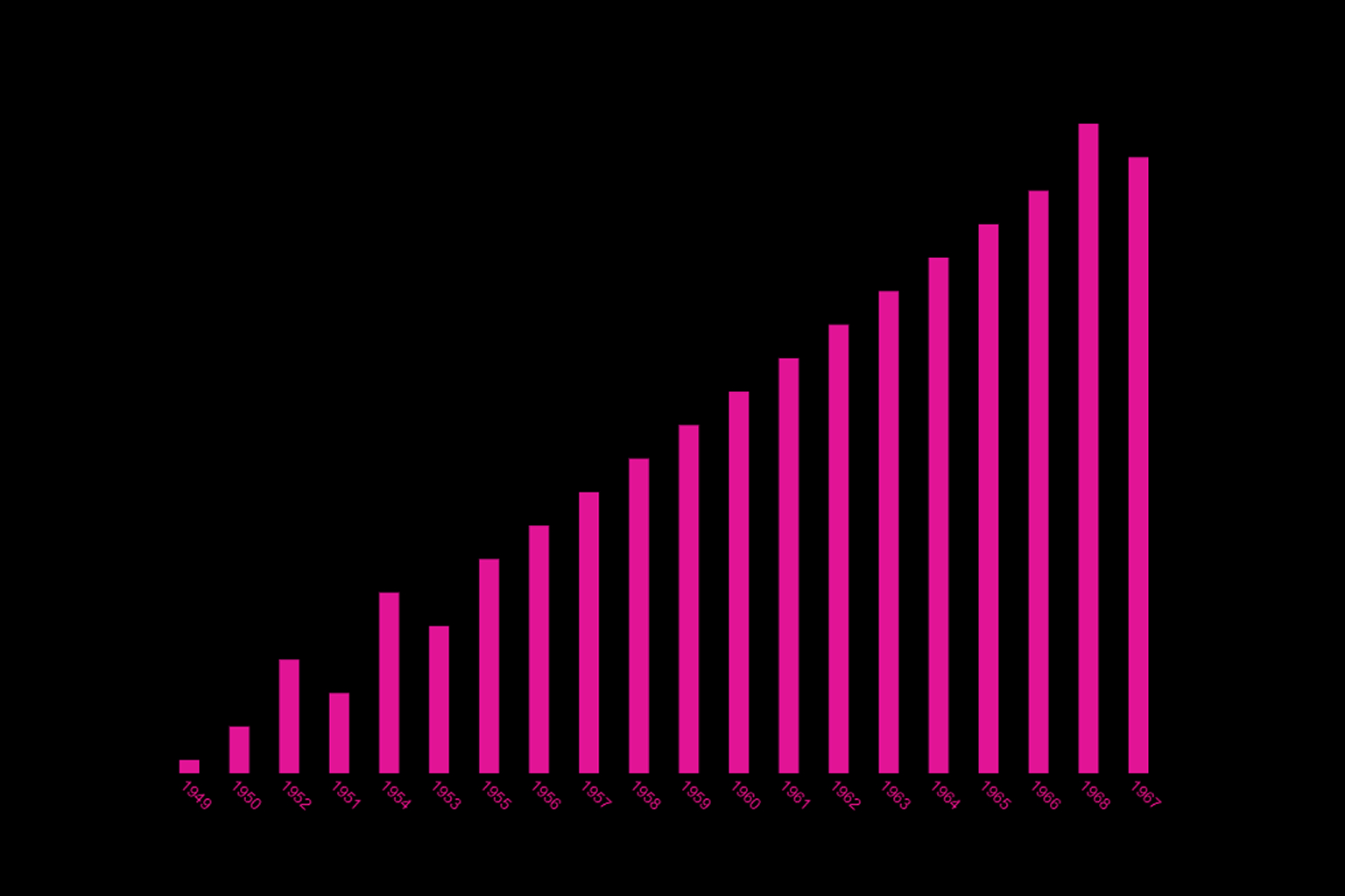
We decided to refine the bar graph that we had previously done for this dataset. We changed the colours of the bars and the background, added the years to the data for explanation on what each bar represents as well as a title to give context to those who are reading our graph.

From the graph above we can conclude the following:
1. The CO2 emission data we received showed that In 1949, CO2 emissions in Afghanistan were at 14,565 tons and in 2017, it was at 13014739.66 tons. There has been an 888x increase in CO2 emission.
2. The data’s main message is to create a sense of urgency to solve the CO2 emission issue before it creates further damage to us and our environment, by comparing the amount of CO2 emission and it’s increase throughout the years.
Below you can find an excerpt from the data we have used. Based on a data set on Climate Change recorded since 1896, we have extracted the following data points that we have worked with:
| Year | Value | 1949 | 14656 |
|---|---|
| 1950 | 84272 |
| 1951 | 91600 |
| 1952 | 91600 |
| 1953 | 106256 |
| 1954 | 106256 |
| 1955 | 153888 |
| 1956 | 183200 |
| 1957 | 293120 |
| 1958 | 329760 |
| 1959 | 384571.42 |
| 1960 | 413883.42 |
| 1961 | 490797.7 |
| 1962 | 688594.27 |
| 1963 | 706735.98 |
| 1964 | 838550.83 |
| 1965 | 1006916.53 |
| 1966 | 1091158.82 |
| 1967 | 1281865.11 |
| 1968 | 1223389.69 |
Data Interpretation
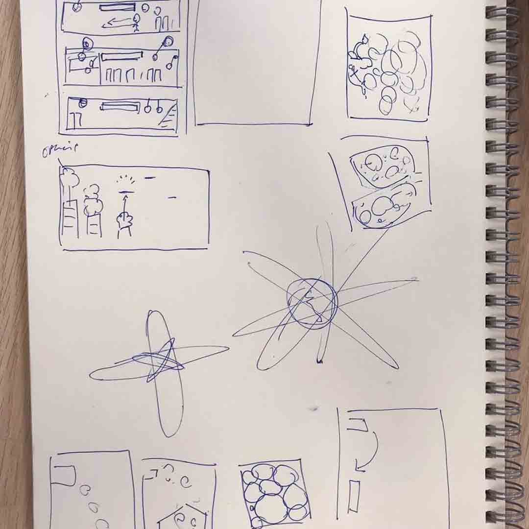
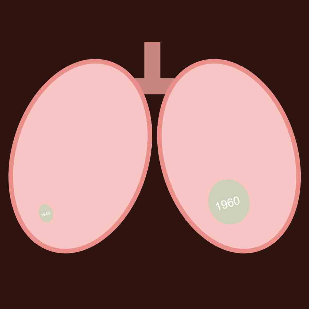
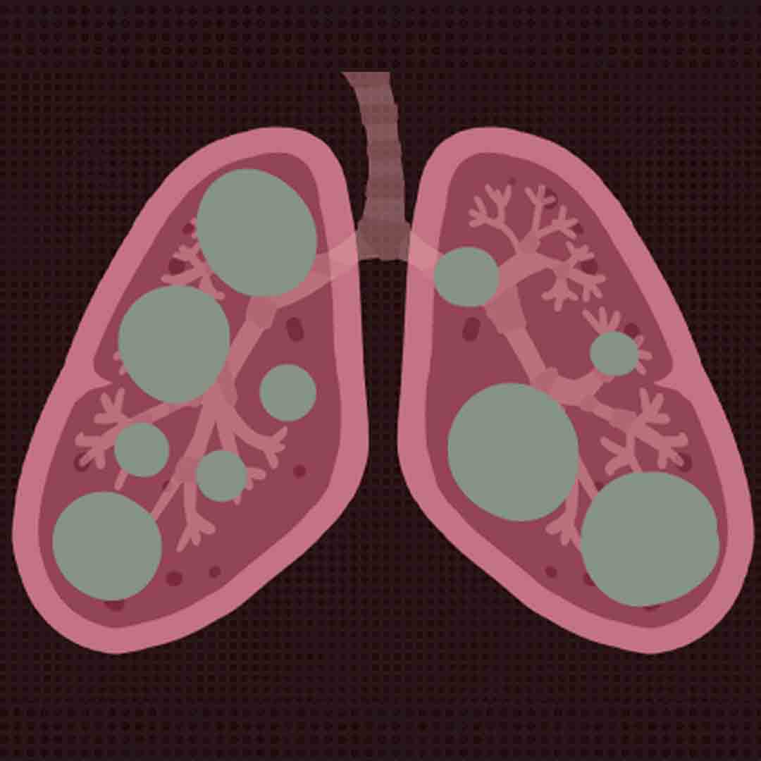
Based on the graph we had previously done, we established that the main message we want to convey is the sense of urgency to solve the issue of rising CO2 emission levels. To create this sense of urgency, we want viewers of our data interpretation to feel an uncomfortable feeling of suffocation. With the increasing levels of CO2 emission levels, we would most likely have more CO2 than oxygen in our lungs in the next few years. To depict this, we animated a set of lungs in p5.js and filled the lungs with balls of CO2. Each ball represents a year of CO2 emissions as recorded in the data of the previous graph we did. We also added coughing and wheezing noises in the background to enhance the suffocating effect that we are trying to bring across to get the viewers to relate to the data on a personal level.

Reflection
This project gave us the chance to experiment with different types of graphs and familiarise ourselves with what works best in what kind of situations. E.g. number of variables, working with proportions and percentage, time based data,etc. Knowing what works best for each kind of data, helps us to come up with effective data visualizations efficiently. This project also allowed us to dive deeper into p5.js and visualising data outside a graph in the form of artworks made by code. It is an interesting exploration between the worlds of numbers and design.
